Understanding Colour Psychology And The Power Of Colours In Interior Design

Colours have a very powerful role in interior design as they can single-handedly set the tone and mood of a room. Different colours reflect different emotions, so choosing a colour depends on the atmosphere you are keen on. People form associations with colours based on personal experiences and cultural contexts.


Understanding colours and their most common attributes is essential to understand how they can be incorporated aptly to design an interior space.

What is colour?

Physics equates colour to how the human eyes and brain perceive light that is reflected off of objects. As per science, an object appears white because different wavelengths of light of the same strength are being reflected at the same time. And black means all the wavelengths are being absorbed instead of being reflected. 


Colours can be classified as follows – 


  • Primary – red, yellow, blue (all colours can be obtained by mixing these)
  • Secondary – green, orange, purple/violet (obtained by combinations of the above)
  • Tertiary – blue/green, red/orange etc. (called grandchildren of primary)

What are the basics of using a colour wheel?

Colour wheels vary based on industry. While some use RBY (the primary colours red, blue, and yellow), some use RGBY or CMYK. And some use tertiary colours and other hues.

From an interior design perspective, keep the following in mind.

      • Complementary colours 

      Eg. Blue – orange, or yellow-violet

      These are used as accents and are used in small quantities. On the colour wheel, they would be directly opposite position wise.

      • Triads

      Eg. Yellow-blue-red, or orange-green-violet

      These are used as accents too, but in a balanced way. On a colour wheel, they make a triangle.

      • Analogous colours

      Eg. Red, orange

      These are right next to each other on the wheel.

      • Monochromatic colours

      Eg. Navy blue – powder blue

      This refers to the use of a single colour, going from dark tone to light.

      • Cool and warm

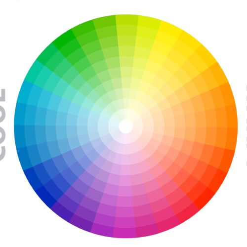
      These help to create a mood. Blue, green, purple are cool colours, and red, orange, yellow, pink etc. are warm.

      • Non-colours

      Eg. Grey, beige, brown, white, black

      These don’t actually have a place on the wheel.

What is the psychology of colour?

According to Wikipedia, colour psychology is “the study of hues as a determinant of human behaviour.” The Ancient Egyptians studied how colour affects moods and utilised the knowledge for holistic benefits. For example, red was associated with increasing circulation, orange with more energy, and blue with pain relief.


Modern psychology expanded the study and usage of colours and incorporated the knowledge into design, marketing, architectural and interior design. Basically, colour psychology identifies the feelings and emotions associated with colours.

What are the colour categories?

Colours can be divided into three categories—warm, cool, and neutral.


Warm colours

These are best as accent colours and are suitable for spaces meant for social activity. They are vibrant, energetic, and reflect excitement.

        • Red catches the eye easily and is associated with love, passion, anger, danger, etc. It is also associated with increasing appetite, the reason why a lot of fast food chains use it for their logo and branding.
        • Yellow, a cheerful colour, reflects joy, youth, and a welcoming feeling. Golden shades give a sense of luxury, and are great as accent colours with neutrals like white, brown, grey etc.
        • Orange encourages interactions and is upbeat and outgoing. It works with neutral colours and adds an element of warmth to spaces.

Cool colours

They give a sense of relaxation and serenity, ideal for spaces meant for deep thinking or as a safe haven.

      • Blue is a very popular colour and is often associated with a sense of inspiration and calm. It evokes focus and creativity, as well as trust and loyalty. A darker shade like navy blue is equated with masculinity and luxury.
      • Green,
        symbolises balance, growth, and harmony, and also relaxes eye muscles. A darker shade like emerald exudes elegance and luxury.
      • Purple is equated with royalty and enhances creativity and energy. It is ideal as an accent for any space, it gives off a vibe of spirituality and magic.

Neutral colours

Neutral colours are flexible and are suitable as a base for other accent colours or by themselves. They reflect harmony.

      • White can make a space look bigger and is symbolic of purity and innocence. While the plain colour may look blank, it works better with accent colours that can be used to express character and mood.
      • Black can be used as an accent to highlight the important pieces in a space. It is associated with mystery and luxury. However, too much of it may be depressing for many people.
      • Grey is associated with security, wisdom, and intelligence. It goes well with any colour, but using only grey may look dull. It is best to pair it with a highlight colour.
      • Browns/beiges give a sense of comfort and stability. They help to bring colour in a subtle and non-overpowering way.

How to utilise the pre-colour phase?

Before finalising a colour palette for your requirements, you must first understand and identify certain specifics.


  • What activity is the space meant for?
  • Who would be the users?
  • What are their ages, likes, dislikes, preferences?

Also, understand the size of your space and finalise the lighting you would use. When you do these, you will be able to identify the temperament and mood for the space, and choose the colours accordingly.


How to choose the right colours?

Once you have answers to the above, choose colours to accentuate and give a visual appeal to your space. We’ll look at three examples to understand this well.


1. Coastal hotel

The St.Moritz hotel, located along the coast, is ideal as an escape from the rush and buzz of the city for a relaxed yet adventurous getaway. The varied selection of stunning rooms – from luxury rooms to villas – looks beautiful with Lokken lounge chairs, their colours giving them a cosy and comfortable appeal while accentuating the aesthetics of the rooms.


2. Work space

For workspaces revolving around flexibility, positive mindsets, and productivity, use colours like brown, orange, and green that reflect positivity just by their presence. For example, the London Banquette in orange circulating around a tree captures the essence of this space – positivity leading to shared connections and interests. Other essentials, like the Wigwam sharing tables and Ikon shelving, add to the charm and aesthetics of the space.


3. Cafe

Treating customers to a sensory and visual treat is the best way to get their attention when it comes to food outlets. While the kitchen whips up delicious treats and bakes at the bakery, the attractive blue Clover side chairs and Dream side chairs invite the customers to relax and treat their taste buds.